Fulfillment Portal
Pitney Bowes
Overview
At Pitney Bowes, I led the redesign of the portal for third-party fulfillment services, which is used for inventory management, order tracking, and more. I transformed the outdated legacy system into a modern and efficient platform. The project focused on overhauling the app and integrating the functionality within the existing Client Connect application, leveraging the Pitney Bowes design system for its modern styling and codebase.
Results
- Streamlined self serve experiences, reducing support calls
- Clients had better visibility into their operations
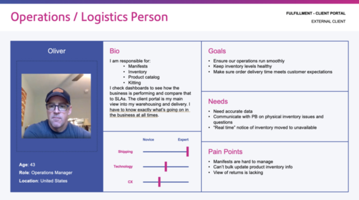
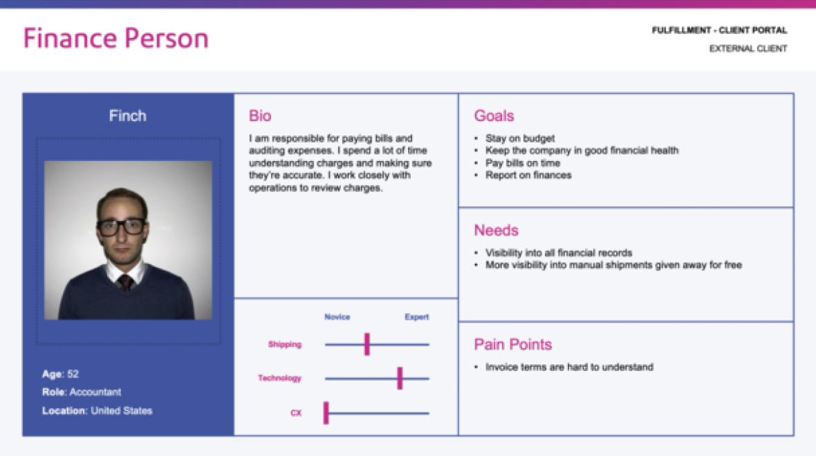
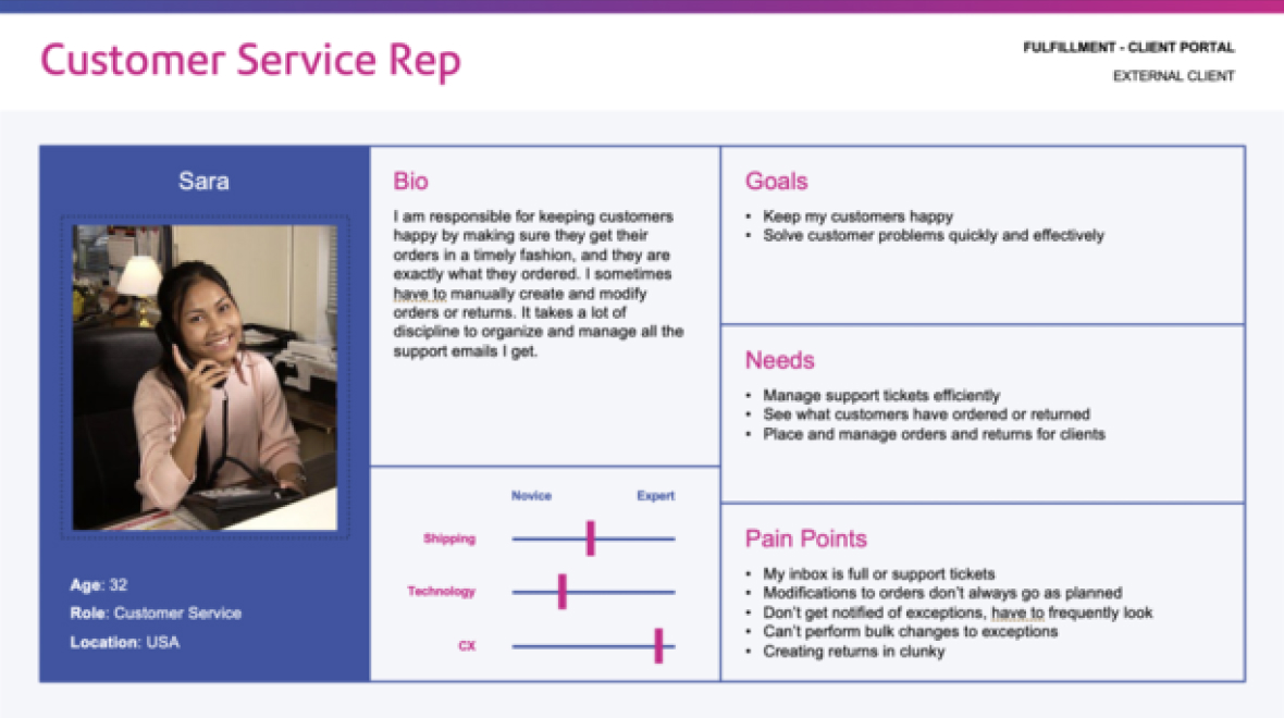
Understanding the Personas & Processes
- I interviewed 17 users to better understand their workflows within the app.
- I created a set of personas that would guide me through the entire redesign.
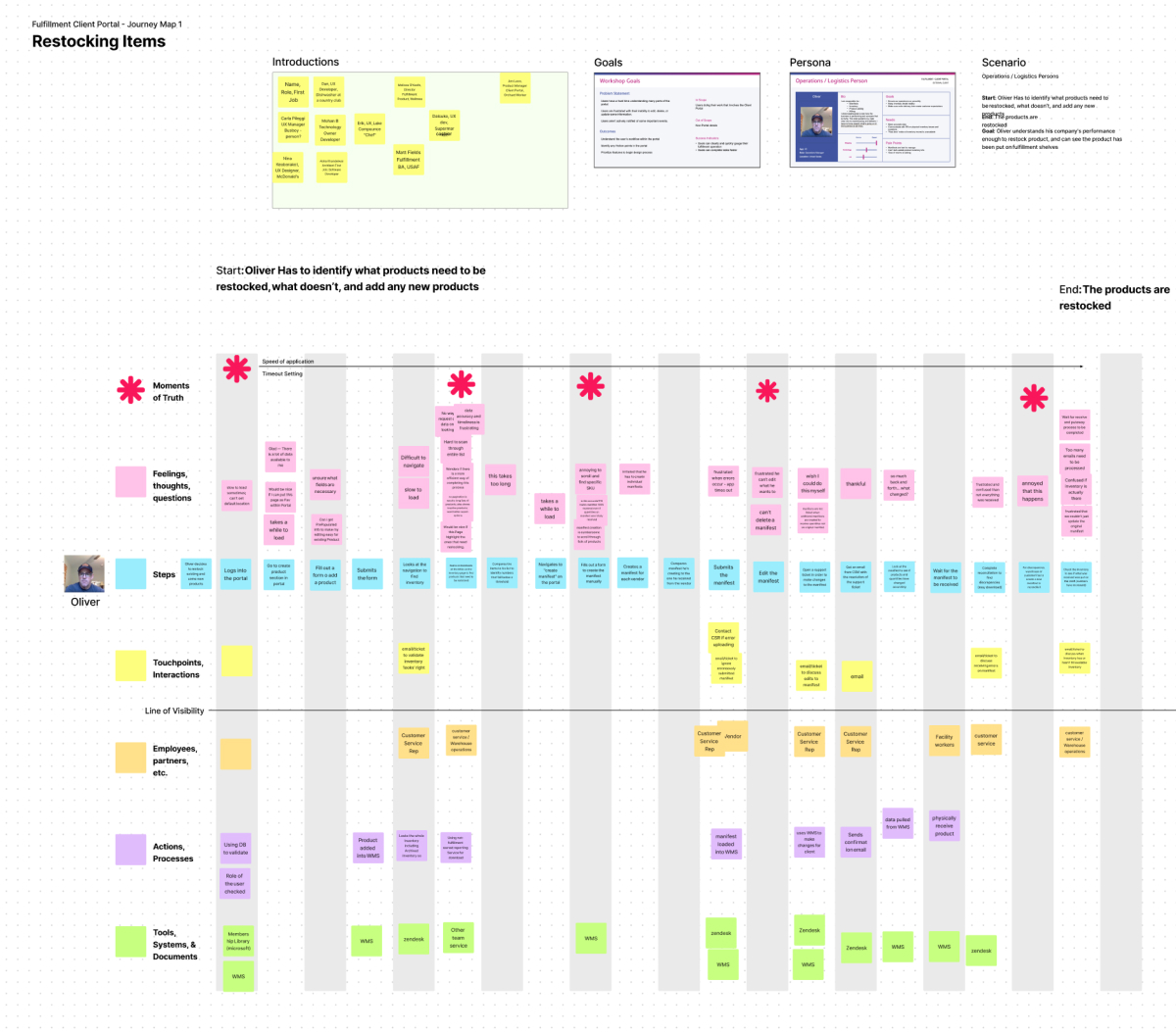
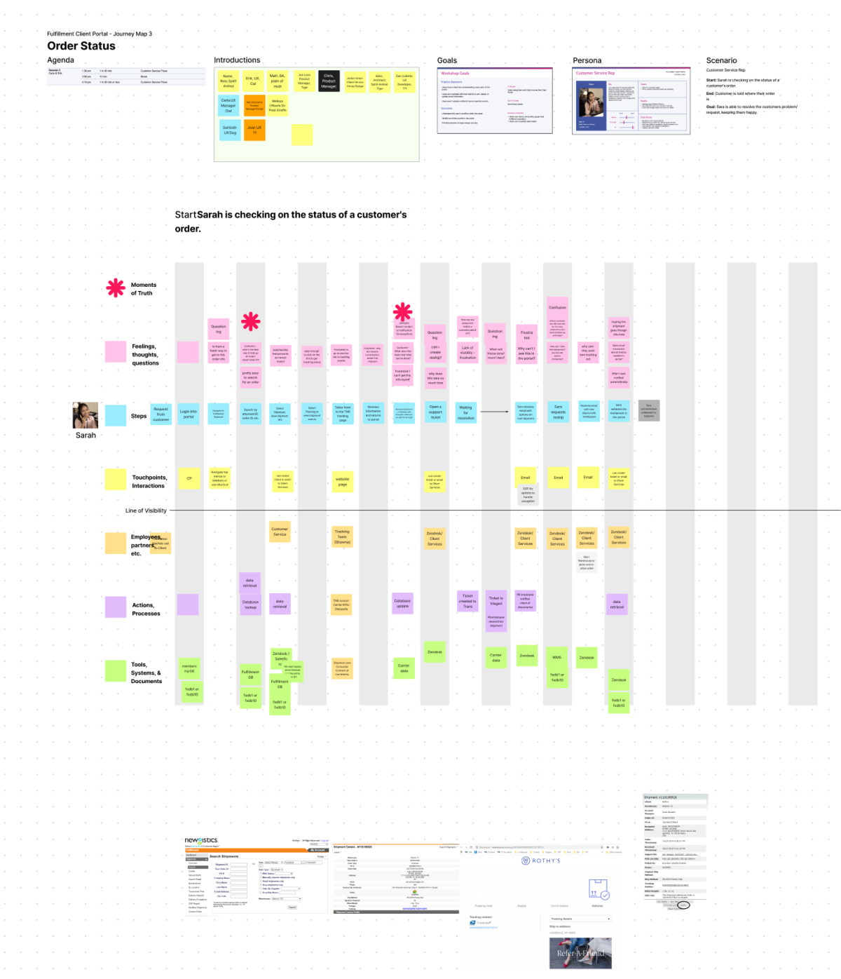
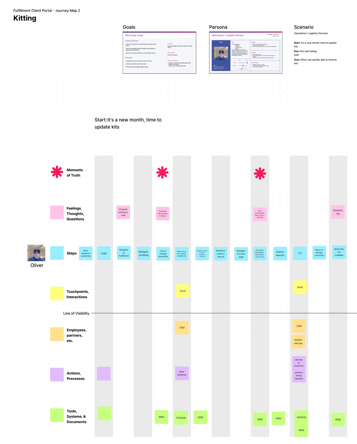
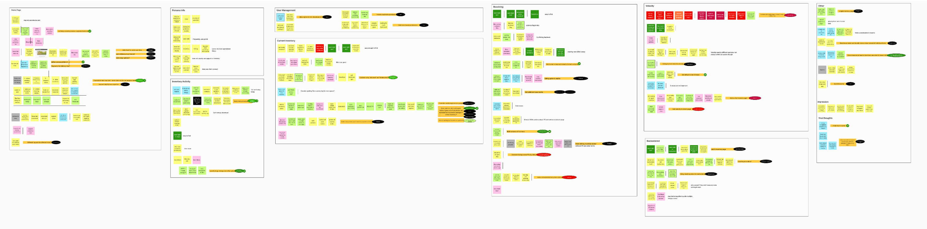
- I developed journey maps with insights from interviews, personas, and stakeholders, identifying jobs to be done and pain points. Some of these pain points were previously addressed in Client Connect, but the remaining issues presented an opportunity to greatly enhance our clients' experience.
Key Findings
- The existing returns flow is broken down into too many steps.
- Manifests can be difficult to parse.
- Some invoice charges are hard to understand.
- Support tickets are hard to manage via email.
- Manual shipments lack granularity.
- Exception management is reactive rather than proactive.
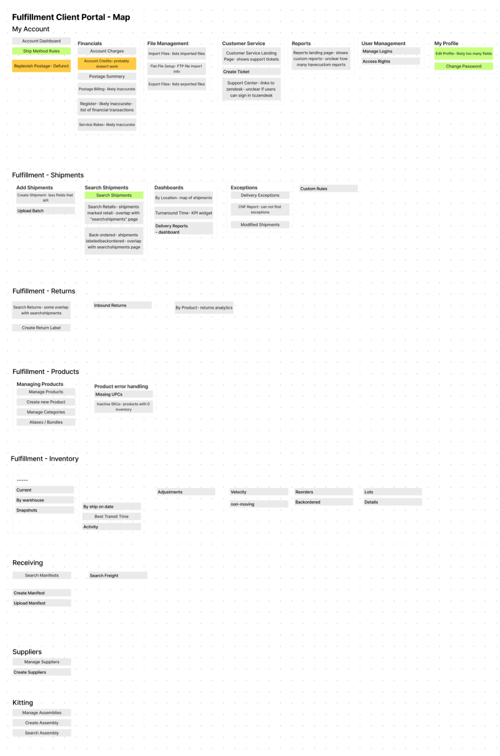
Information Architecture
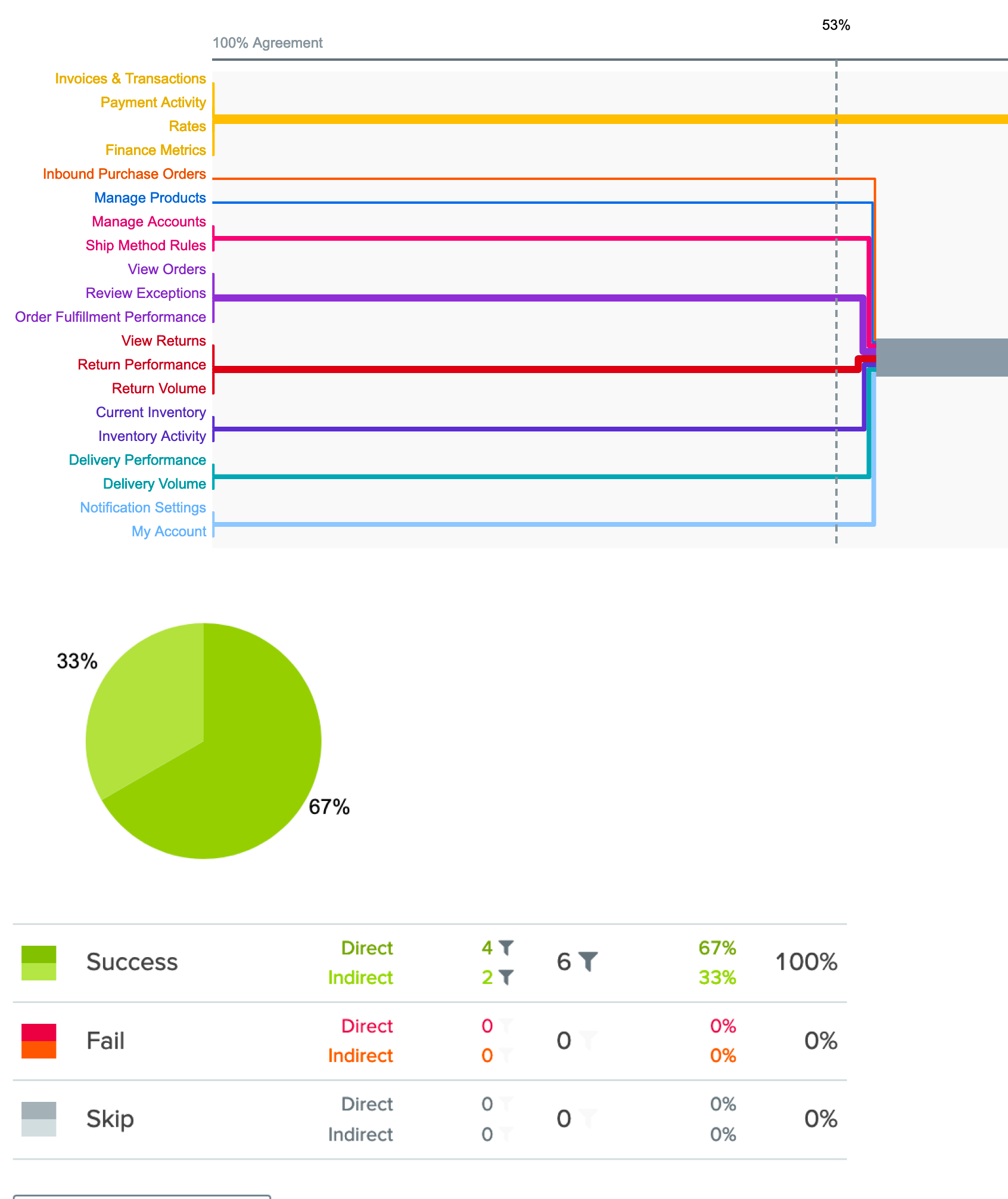
With a deep understanding of the various workflows, it was time to figure out how they all fit together in the app's navigation. I conducted two rounds of testing to ensure the navigation matched with user's mental models.
- A card sorting activity with 12 participants to understand how they felt each page was connected.
- A tree test where 18 participants were given a task and asked to navigate to the relevant page. Participants were able to navigate to every page, but they were not confident with some page titles, so we updated the titles based on their suggestions.
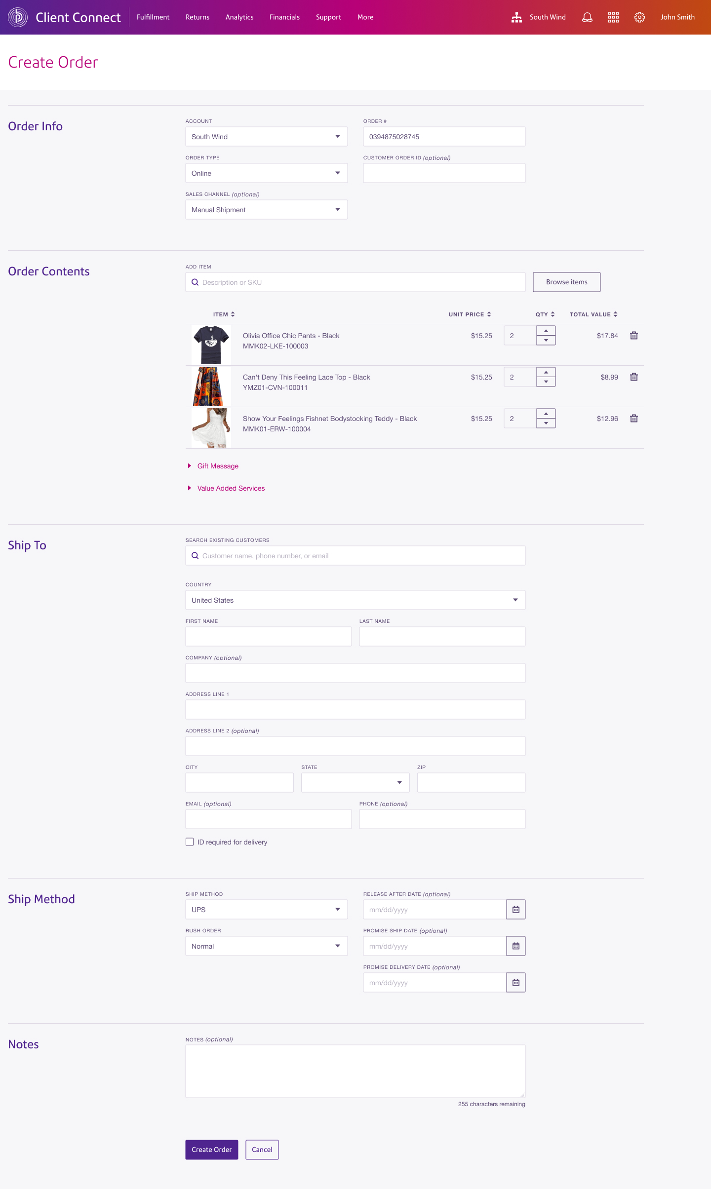
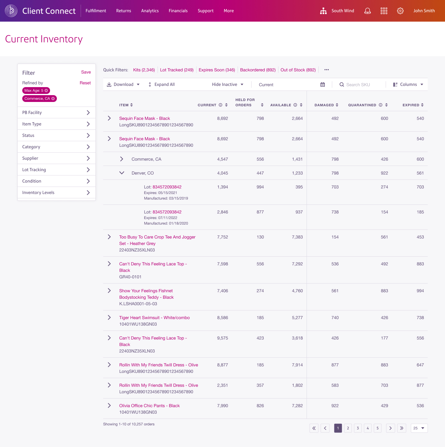
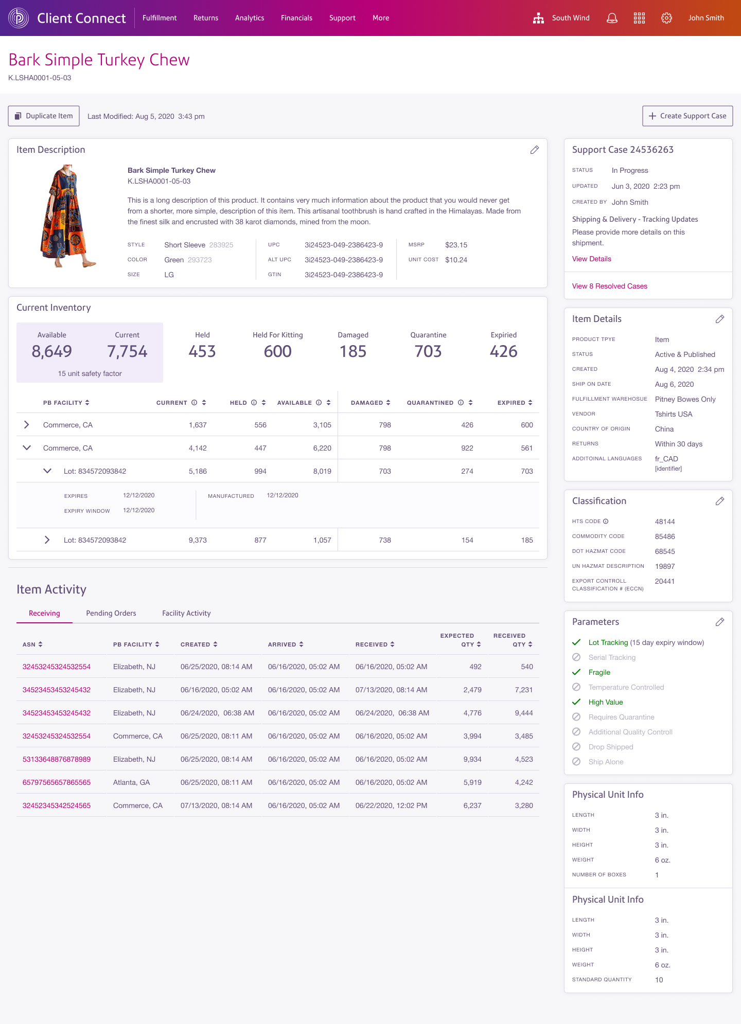
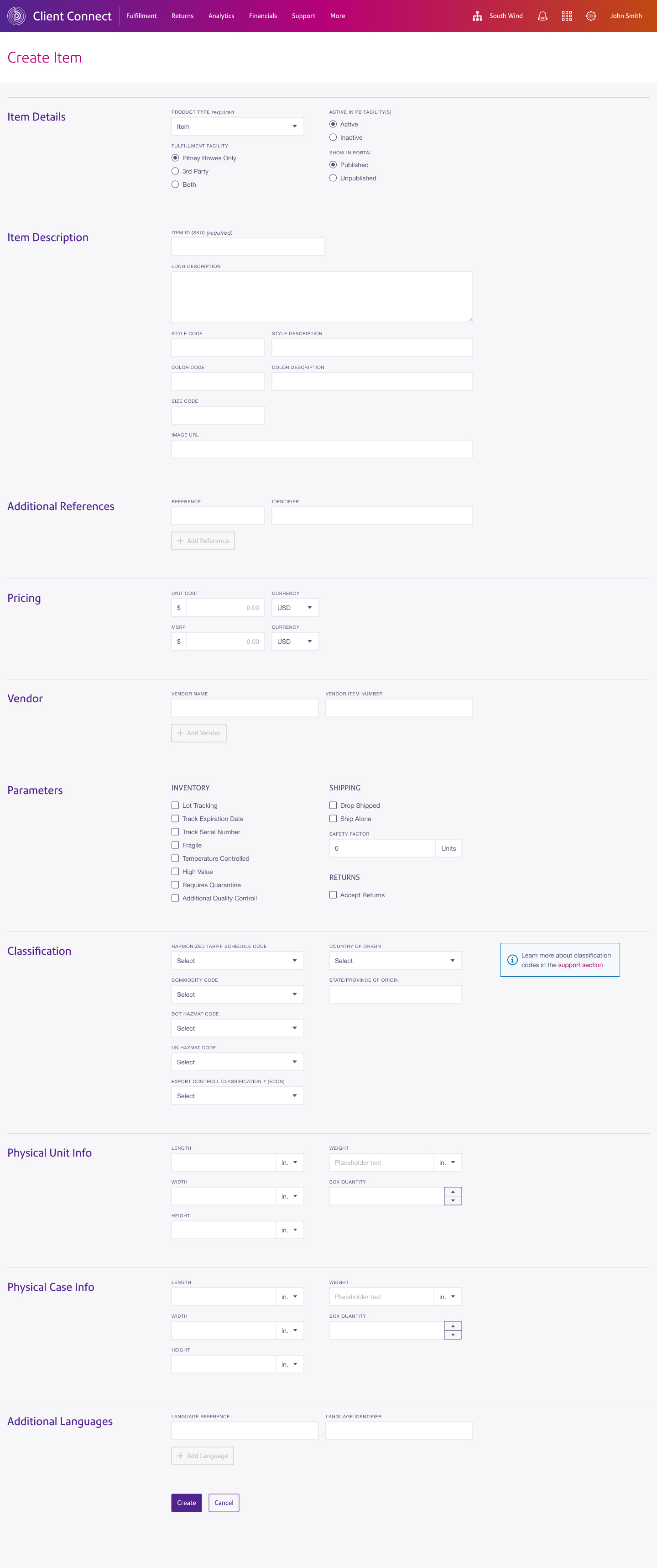
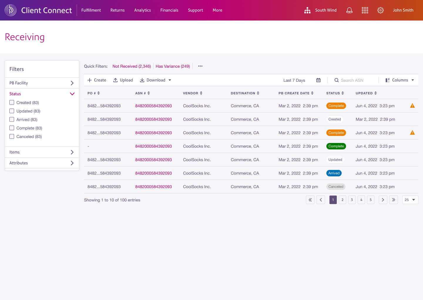
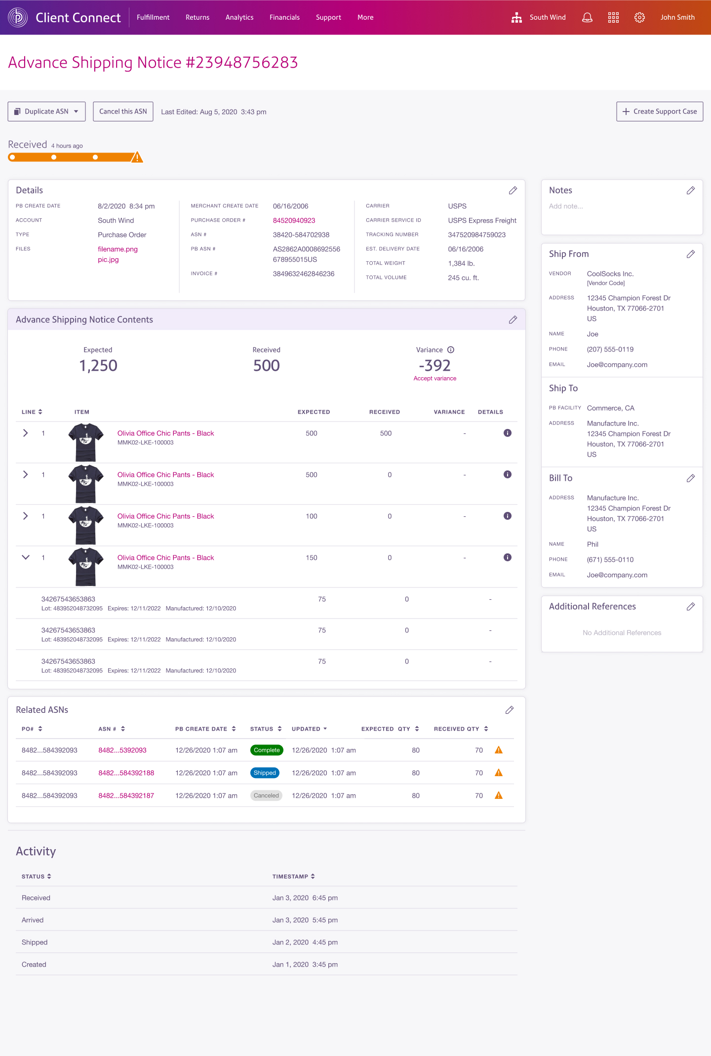
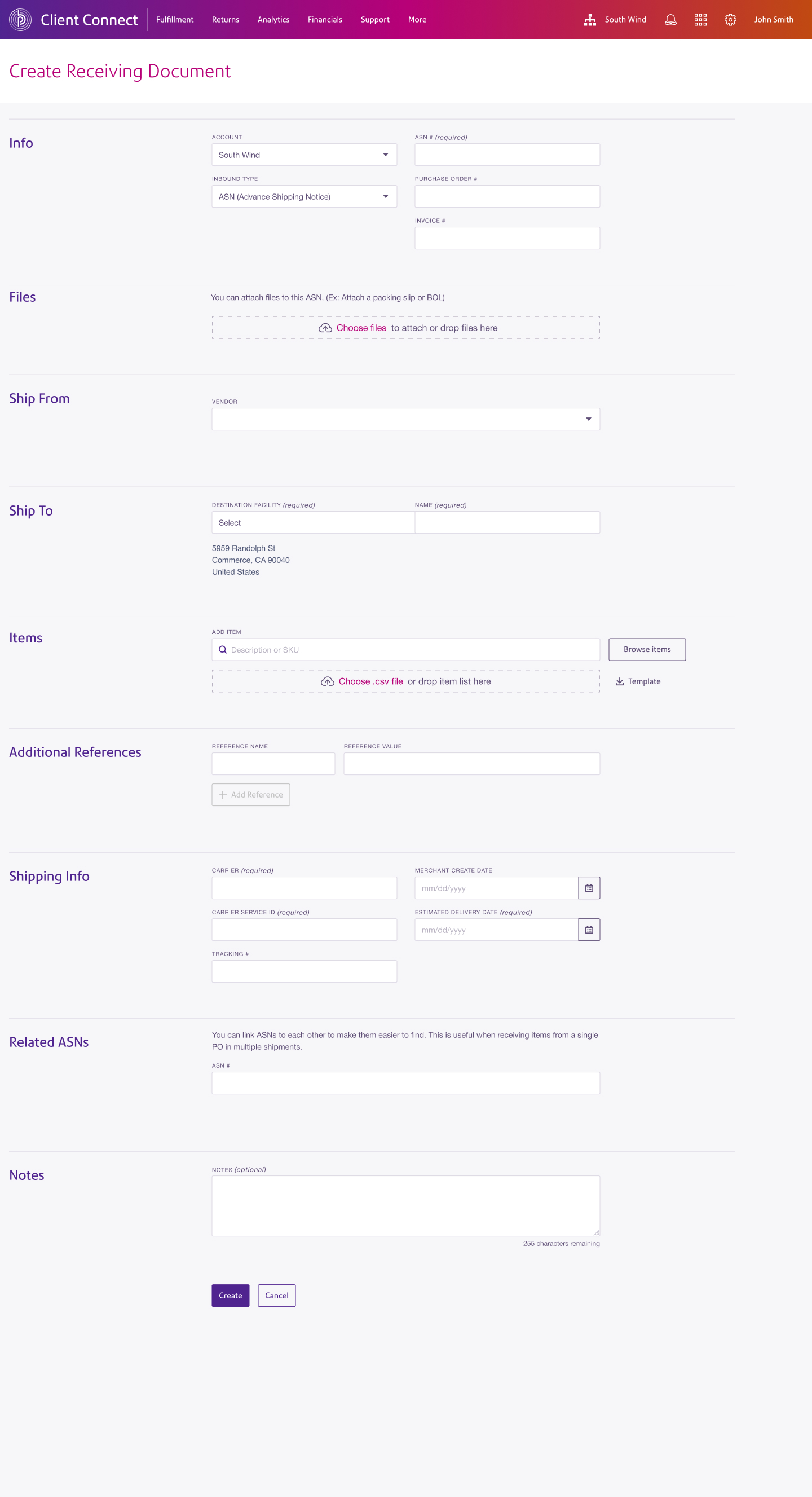
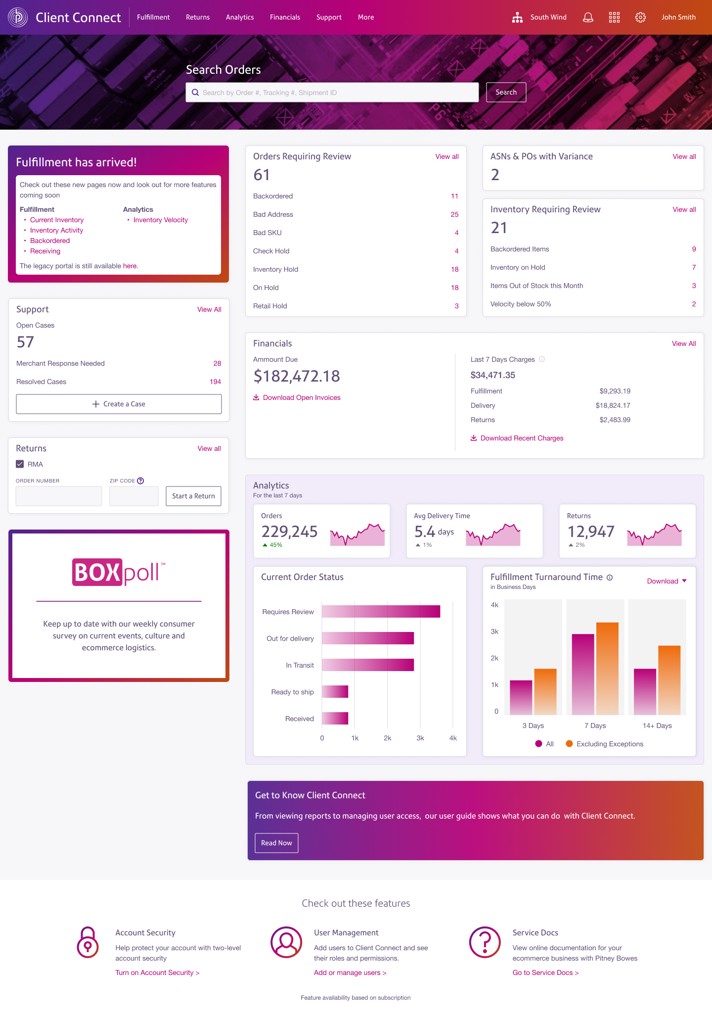
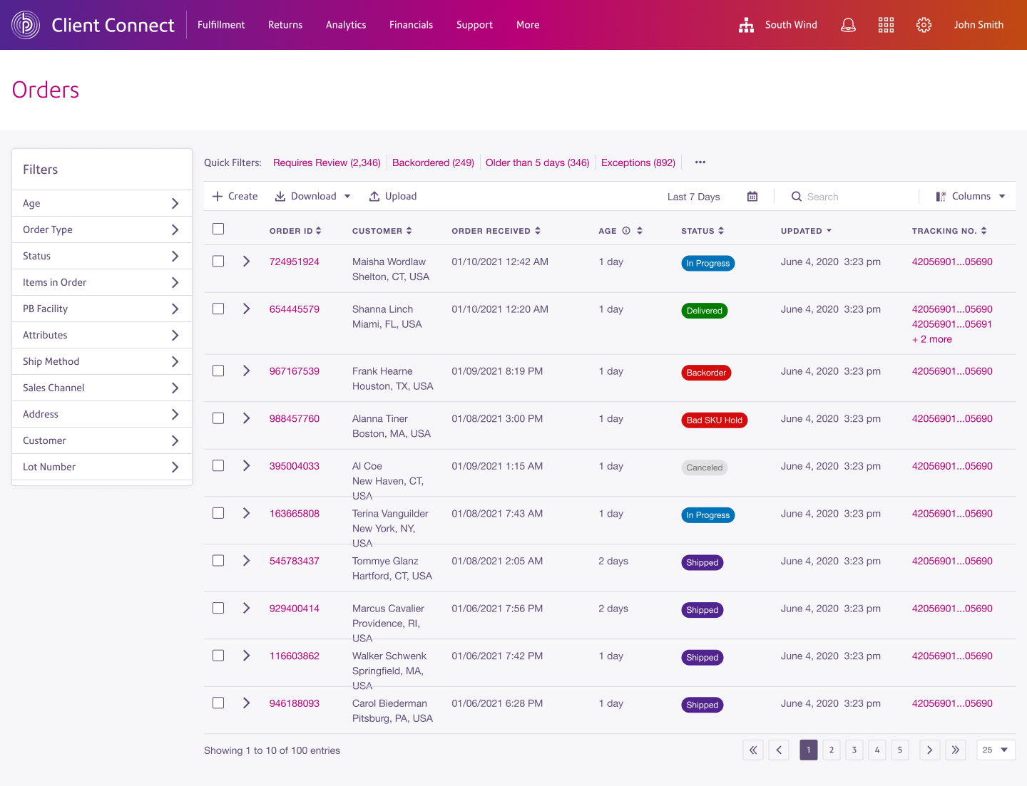
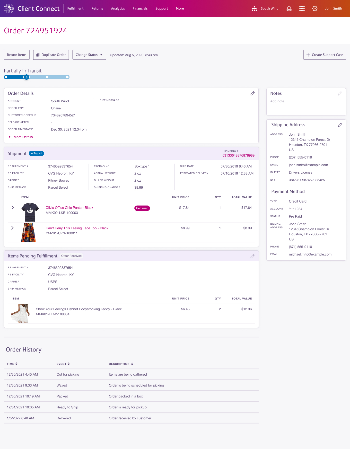
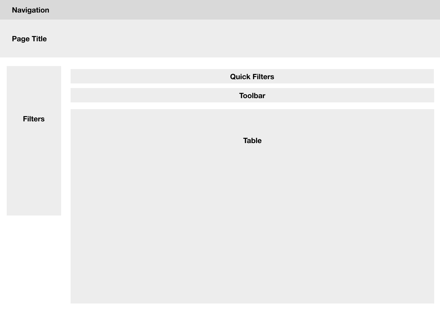
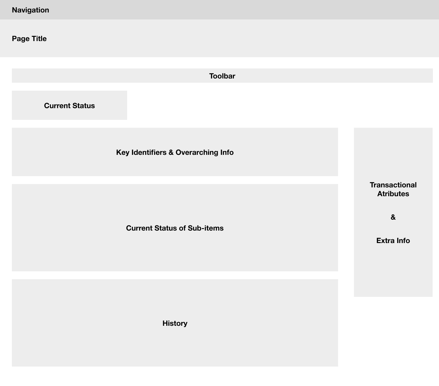
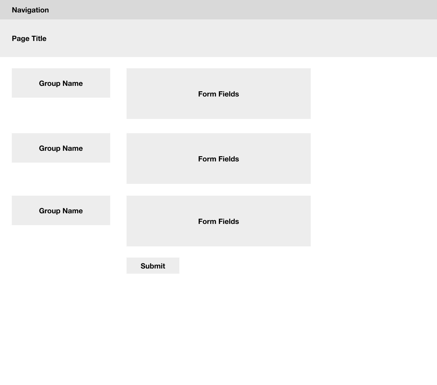
Designing a Data Dense Application
Users needed visibility into a lot of data points. Organizing such complex information required a deep understanding of each attribute and how they all worked together to form the full picture of an order, inventory item, or return. Each piece of information also had to be considered for its value, not only to the end user (clients) but also its impact on internal users, stakeholders, and the end consumer buying from the client.
Working with stakeholders, I was able to understand the data available to the users and cluster it to convey the important information at a glance. This proved to be a challenge given the wide range of user needs, from answering customer support questions about their orders to updating the hazmat code for a particular item.
In order to reduce the apparent complexity of fulfillment workflows, it was important to have a clean and simple layout that was flexible enough to use throughout the app. This provides users with a familiar interface no matter which page they're on.
User Testing
With the mockups in hand, I went back to the users for testing. First I tested with internal users to make sure any obvious flaws were resolved, then I proceeded to testing with actual clients. I started each interview by asking the user to give a brief overview of what they do in legacy app, and followed up with a series of tasks that would take them through the pages relevant to them.
Feedback
- Different users had different names for the same thing, so I renamed several fields and added tooltips with definitions as needed.
- Users were primarily looking for adjustments on the inventory activity page, so that should be the default view.
- Users preferred to spend less time in excel filtering and sorting.
- One user remarked “This is way more dynamic and user friendly than the old WMS.”
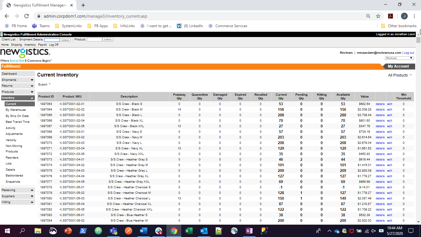
Before
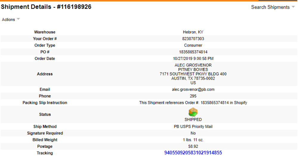
After